Share
Preview
Church Motion Graphics
How To Choose The Right Character Spacing For Your Lyric Slides
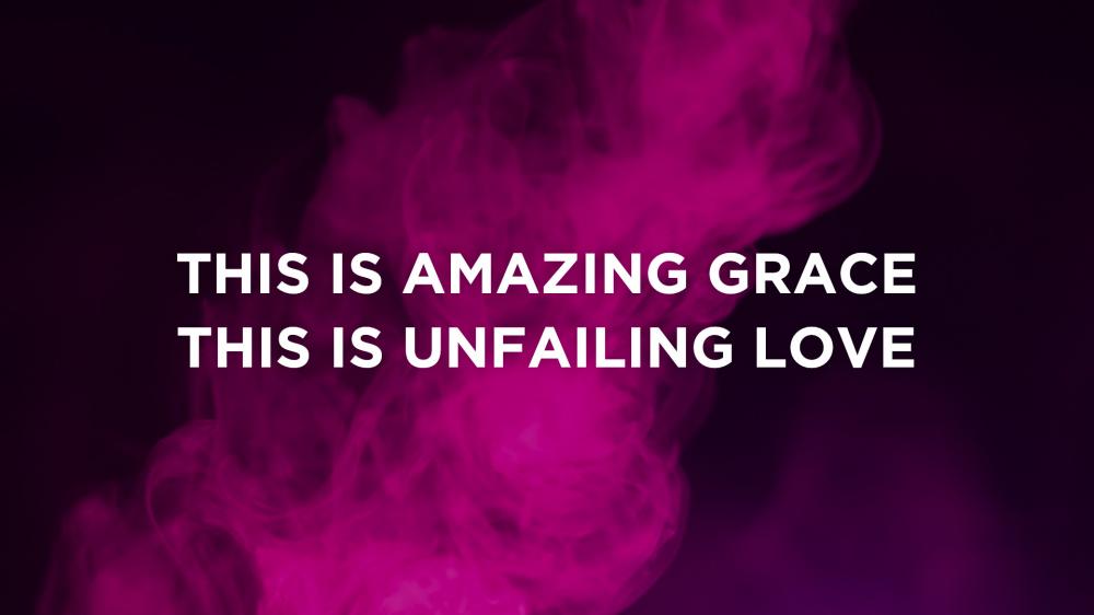
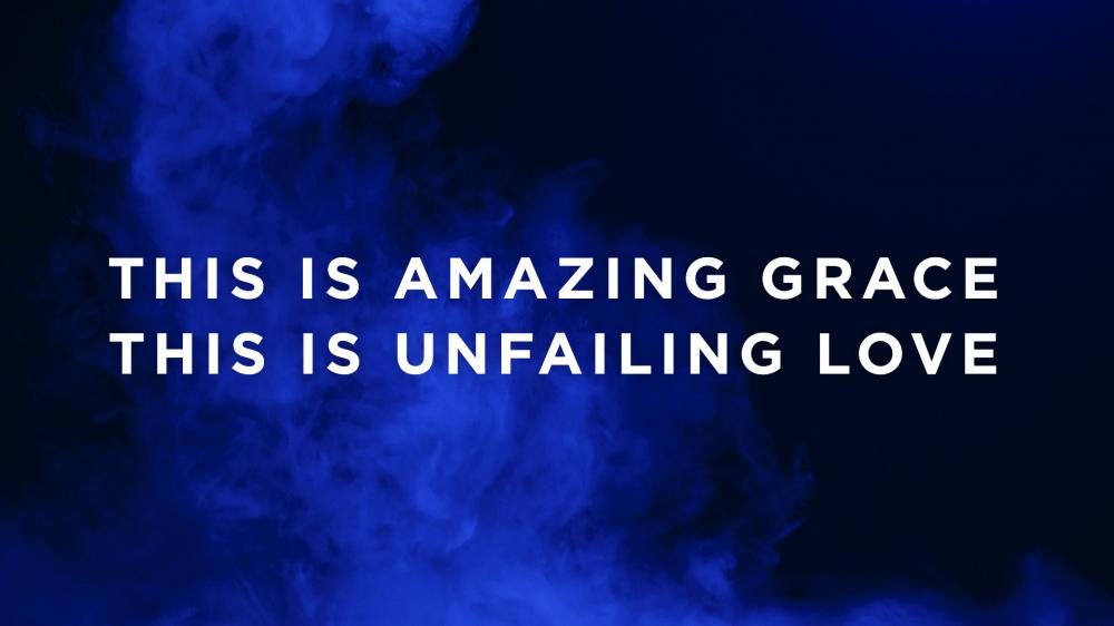
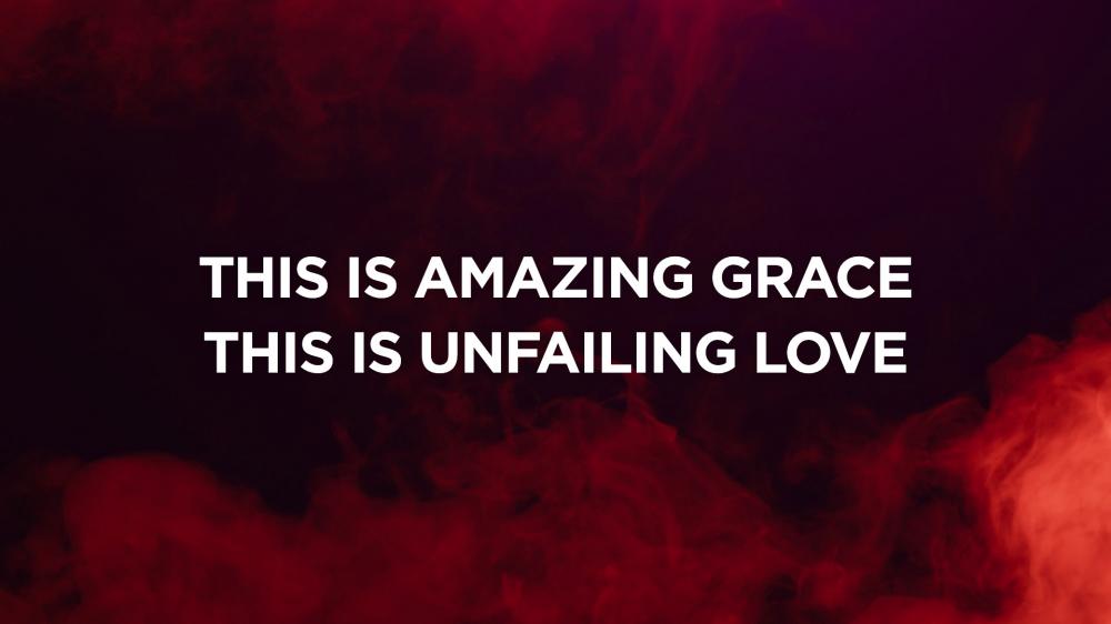
Character spacing, more commonly referred to as tracking, is the amount of space between letters throughout an entire word, sentence, or paragraph.

By adjusting this setting that’s available with nearly every presentation software, you can dramatically alter the look of your lyric slides. Even more, this feature allows you to adjust the width of text to fit more naturally in your slides without compromising your professional look (as perhaps stretching your text would).

Here are three examples of character spacing and their benefits:
1. Standard (Tracking: 2)
Traditional, reads easily, works across all fonts
From The August 2017 CMG Pack (Font: Gotham Bold)
2. Wide (Tracking: 14)
Sophisticated, fills slide well, looks great with all caps
From The August 2017 CMG Pack (Font: Gotham Bold)
3. Narrow (Tracking: -3)
Stylish, fits more text on small screens
From The August 2017 CMG Pack (Font: Gotham Bold)
 
New Motions
New! Motion Backgrounds For August
Subscribe To Make This Pack Yours For $10
Watch Video Previews
Free Motion
Now Available! An Exclusive Free Motion Background For August
Download Now
Questions? We're here to help.
support@churchmotiongraphics.com


Church Motion Graphics Inc.
13 - 4 Alliance Blvd. Suite 238
Barrie, ON L4M 7G3
Canada


Email Marketing by ActiveCampaign